ESTATE SERVICING HUB
CLIENT PROJECT | PRODUCT DESIGN | NDA PROTECTED
Designed a secure digital experience that simplifies estate account resolution for families and financial institutions.
CLIENT
Estate Servicing Hub
YEAR
Dec, 2024 – Feb, 2025

Portions of this project are protected under a non-disclosure agreement. This case study focuses on my design process, branding, and problem-solving approach while respecting client confidentiality.
The Problem
Estate account resolution is often a fragmented, stressful process requiring families to repeatedly submit the same information across multiple organizations. Estate Servicing Hub aims to simplify that experience through a secure, centralized platform that guides users through each step while reducing administrative complexity.
So how did we do it?

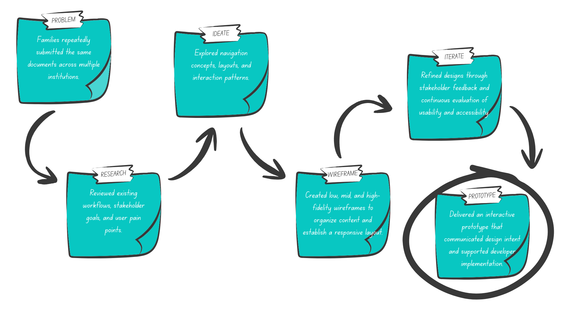
I worked as the Product Designer, collaborating with stakeholders and developers to translate business goals into intuitive digital experiences. My responsibilities included UX research, user flows, wireframes, interface design, responsive layouts, branding, accessibility, and developer handoff.
My Role
Goals
Improve clarity for users navigating emotionally difficult situations.
Design a responsive experience that balances usability with compliance.
Reduce friction throughout complex workflows.
The Process
(Click me)
The Brand Identity
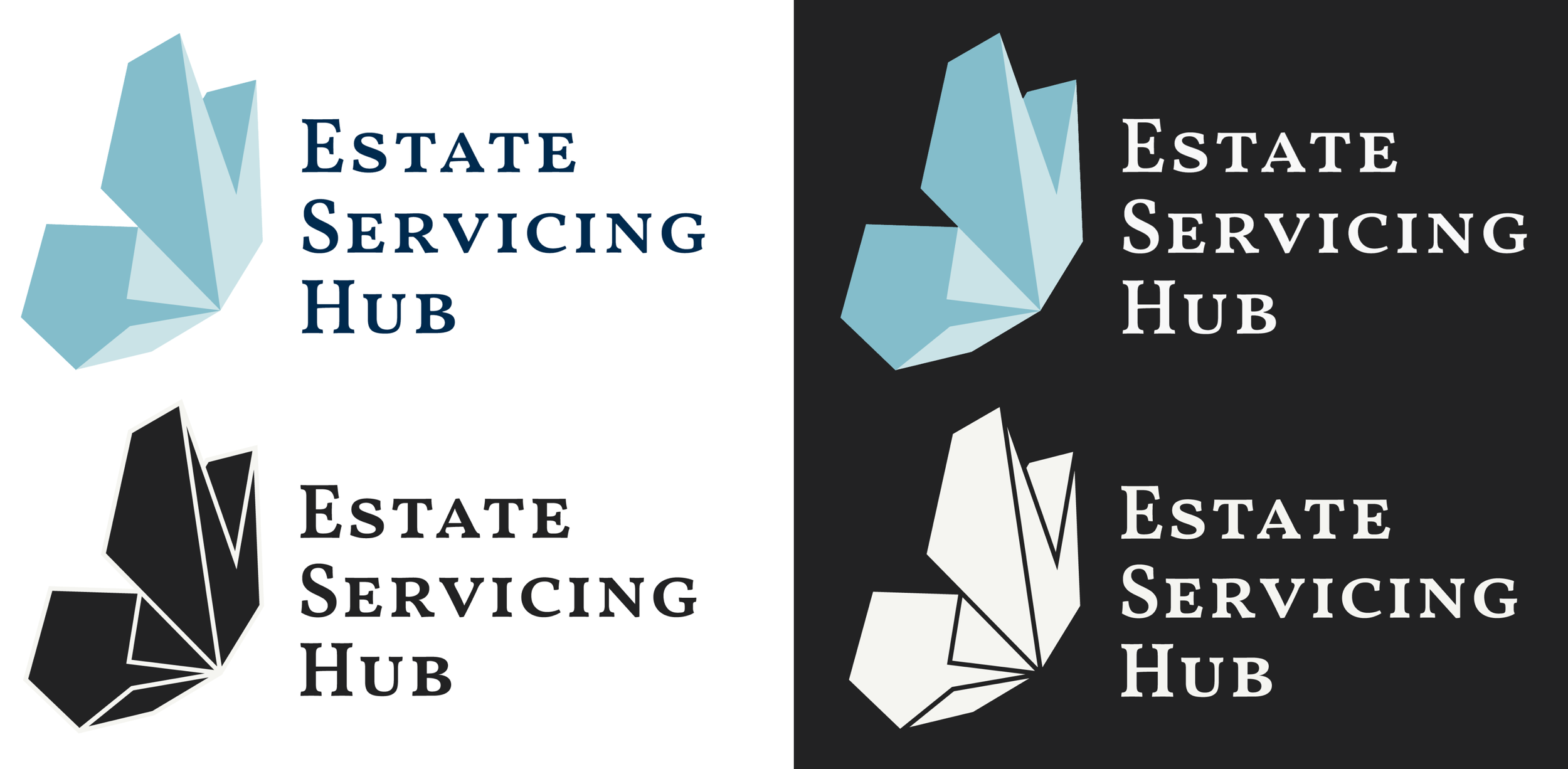
The logo exploration began with a series of sketches focused on communicating trust, guidance, and transition. A butterfly became the strongest concept, representing renewal and the journey from one stage of life to the next while reinforcing the supportive nature of Estate Servicing Hub.
Logo
SKETCH

ITERATE

FINAL
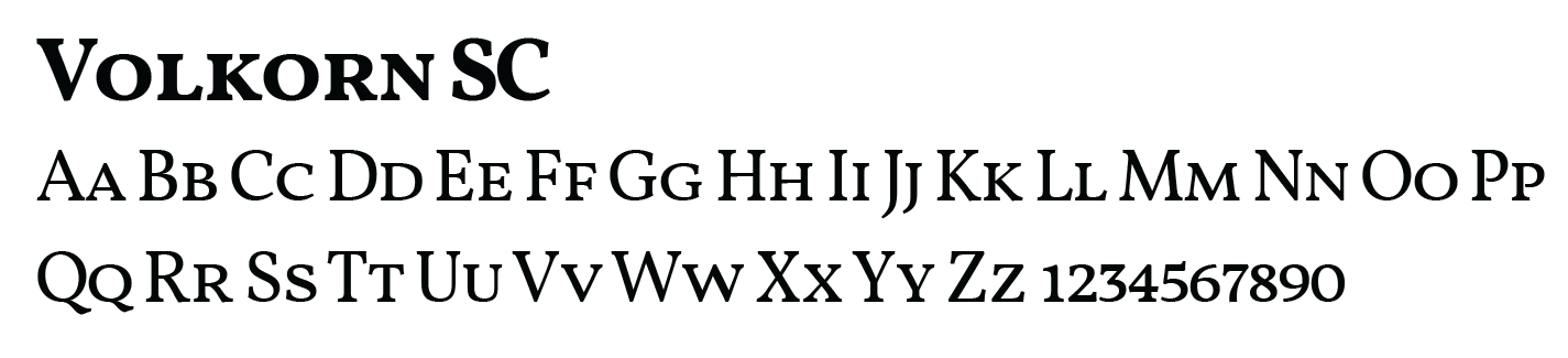
Volkom and Proxima Nova were selected to create a balance between professionalism and accessibility. Volkom establishes trust and credibility through its refined serif character, while Proxima Nova provides excellent legibility and a modern, user-friendly reading experience across the website.
Typography

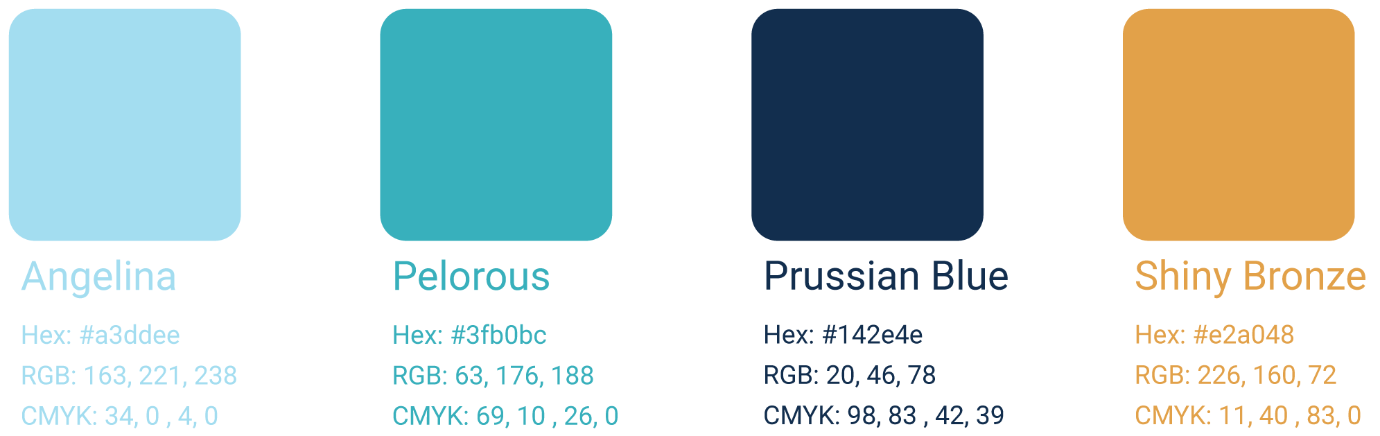
The color palette was chosen to communicate trust, clarity, and compassion. Pelorous and Prussian Blue establish reliability and professionalism, while Angelina adds a sense of calm. Shiny Bronze, positioned at the heart of the butterfly, symbolizes hope and empathy. This reinforces Estate Servicing Hub's role in guiding families through life's most difficult transitions
Colors
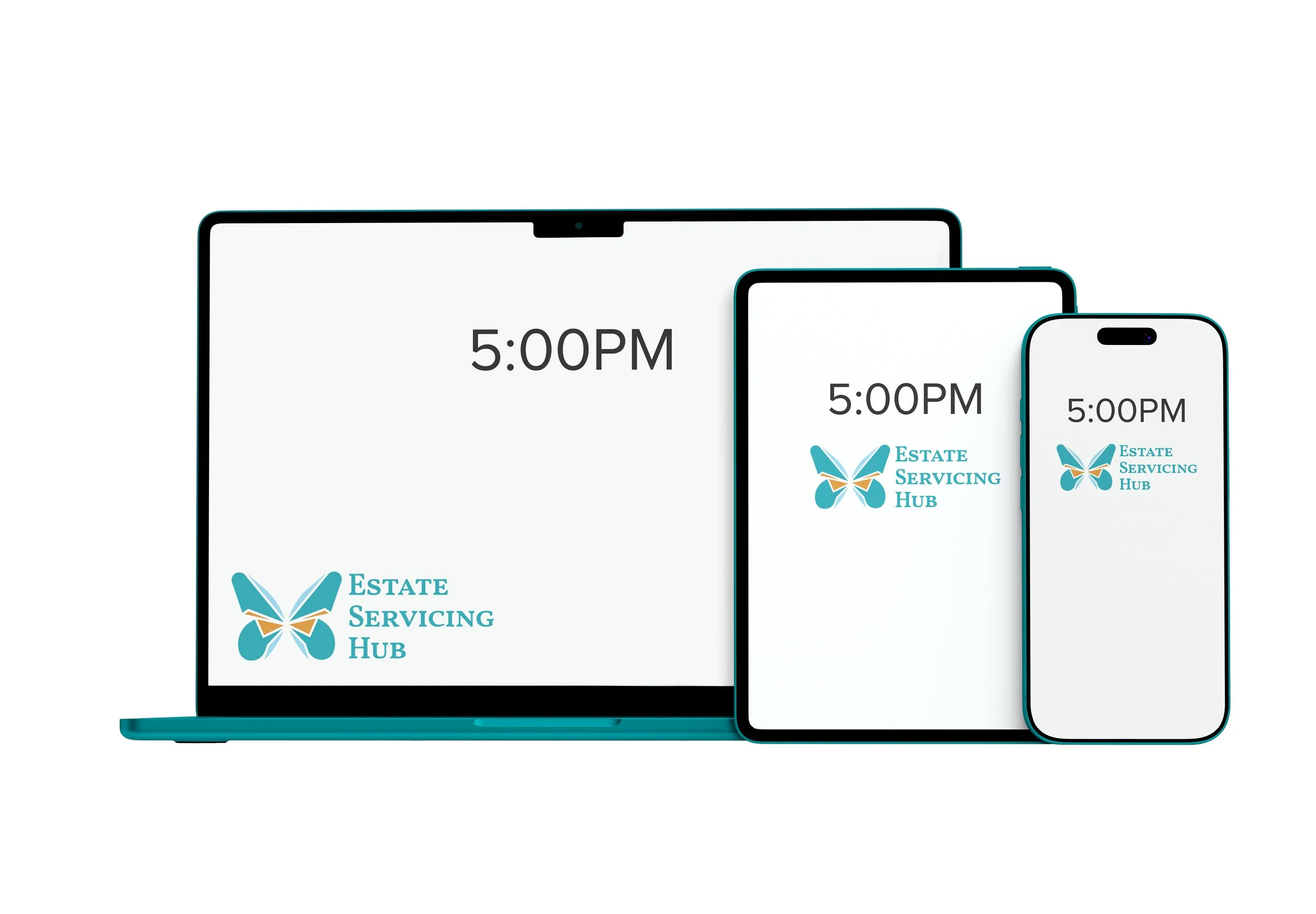
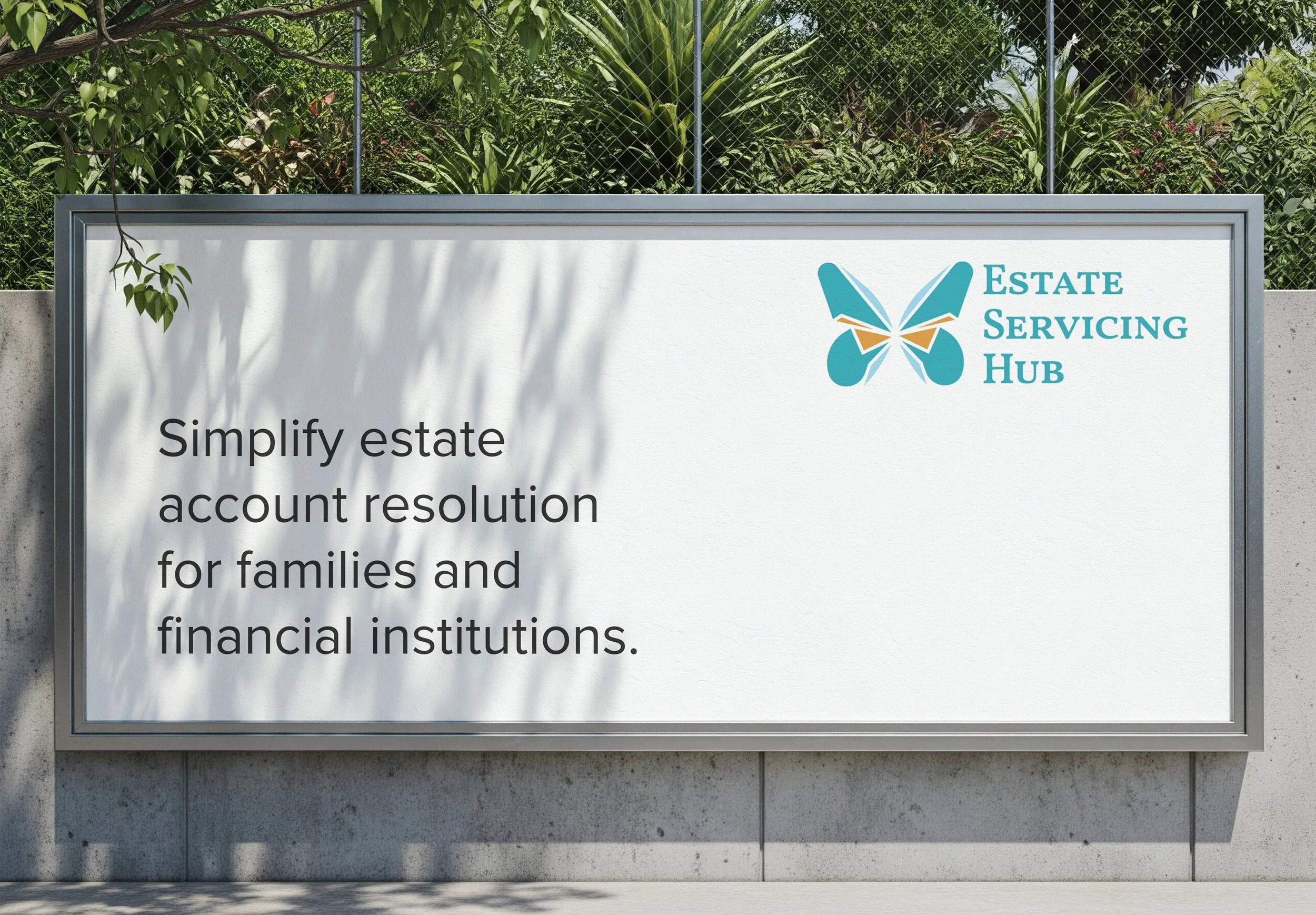
The logo evolved around a butterfly as a metaphor for new beginnings and moving from one stage of life to the next. Its combination of sharp and soft forms reflects the emotional journey of estate resolution. Acknowledging the difficulty of loss while representing guidance, closure, and hope for what comes next.
Refined Identity

Outcomes & Reflections

Reduced the primary workflow from 7 steps to 4

Developed a cohesive visual identity for the MVP

Created reusable UI components and responsive layouts

Improved navigation clarity and accessibility