

“A Journey Through History”
►
►
►
►
History enthusiasts, particularly Gen Z, lack a dedicated travel app that helps them plan trips focused exclusively on historical sites and experiences. The goal of Past Paths is to provide history enthusiasts with a dedicated platform to discover, plan, and experience travel centered around historical sites and stories.
Research and Discovery

GEN Z TRAVELERS
70% of Gen Z travelers are looking for “new places” to travel with family and friends

VARIETY OF PEOPLE
Users need a travel history app that is personalized and informative
RESULTS
Through 10 interviews, we learned that 88% are actively looking for historical travel destinations
Based on our findings, we sketched multiple concepts in Figure 1, focusing on essential features that addressed user needs. We then refined these into mid-fidelity wireframes in Figure 2, adding key functions and clarifying navigation to improve usability.
Ideation and Wireframing
Figure 1 (Low-Fidelity)
High-Fidelity Wireframes
Figure 2 (Mid-Fidelity)

Home

Trending

Map
Map

Directions

Podcast

Podcast

Podcast Playlist

Itinerary

Itinerary Options

Profile
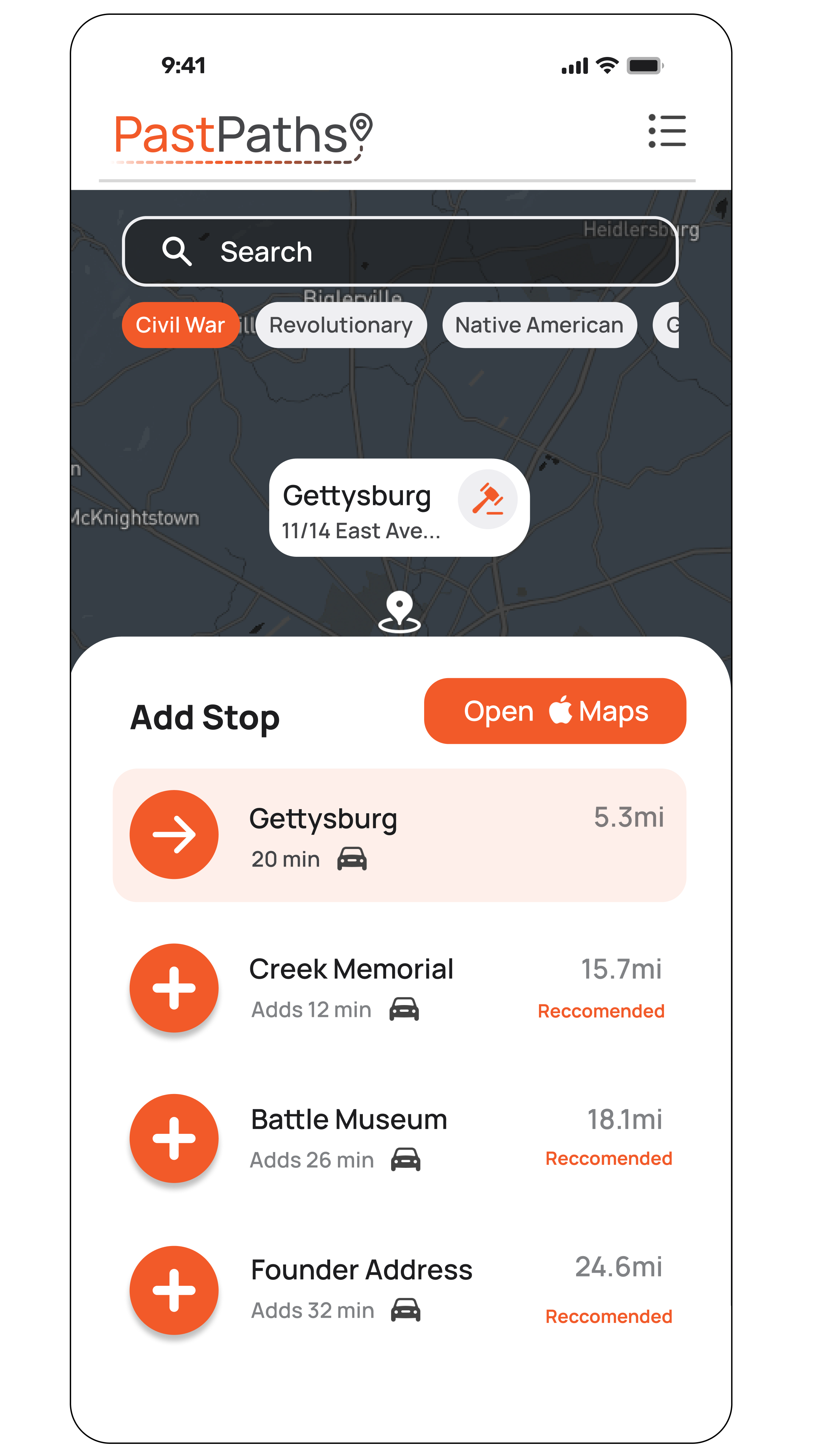
UI Design and Branding
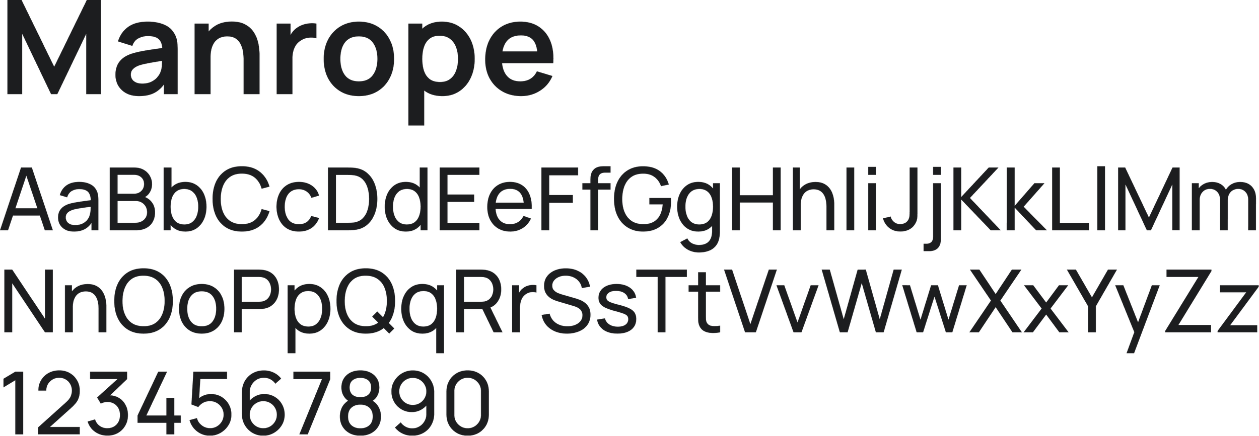
In the high-fidelity design, we focused on creating a seamless navigation experience. Color was used to highlight clickable elements, a clean sans-serif typeface improved legibility, intuitive icons supported quick recognition, and a consistent bottom navigation bar ensured users always knew where they were within the app.

Orange is used for emphasis and call-to-action buttons. It creates a strong visual hierarchy and draws users to interactive elements.
Typography supports brand tone by being approachable, modern, and functional, while keeping historical content easy to digest.


NAVIGATION

Prototyping and Testing
To ensure users had the best experience with the app, we conducted usability testing with ten participants. We asked them to complete tasks and share feedback on their overall experience, pain points, and any areas of confusion. This process helped us identify what worked well and where improvements were needed, guiding refinements to navigation and clarity.
BUTTONS
Check out my Prototype!
Click Expand to Start!!
90% completed the main navigation task on their first attempt

30% suggested stronger visual cues for clickable elements.
RESULTS
Improve navigation between pages
Intuitive button layout/larger pictures
Recommendations & Categories
Conclusion and Key Takeaways
This project highlighted the value of user testing in refining navigation, clarity, and accessibility. Small design adjustments made a significant impact, reinforcing the importance of an iterative, user-centered approach.
Include more Prominent Pictures
Find the Root Cause of Confusion
An Intuitive and Consistent Button Layout