

►

Design Your Ride. See It Come Alive.
►
►
►
To understand real in-store needs, my team and I visited a Vans retail location and interviewed an employee about customer behavior and customization habits. We learned that the Vans’ skate section feels indistinguishable from other stores, many customers want help building custom boards, and there is a clear opportunity to offer a more tailored, interactive skate experience.
Research and Discovery
Vans’ retail space does not have any differentiators from other skate stores in terms of their skateboards

Decent amount of customers looking to make custom boards, all staff know how to build boards
Customers need a tailored experience, more customization options, and a better skate experience
INDISTINGUISHABLE

VARIETY OF PEOPLE
OPPORTUNITIES
Based on our findings, we began creating low-fidelity wireframes for the in-store experience shown in Figure 1. We then refined these into mid-fidelity wireframes in Figure 2, adding key functions and clarifying navigation to improve usability.
Ideation and Wireframing
Figure 1 (Low-Fidelity)
High-Fidelity Wireframes
Figure 2 (Mid-Fidelity)
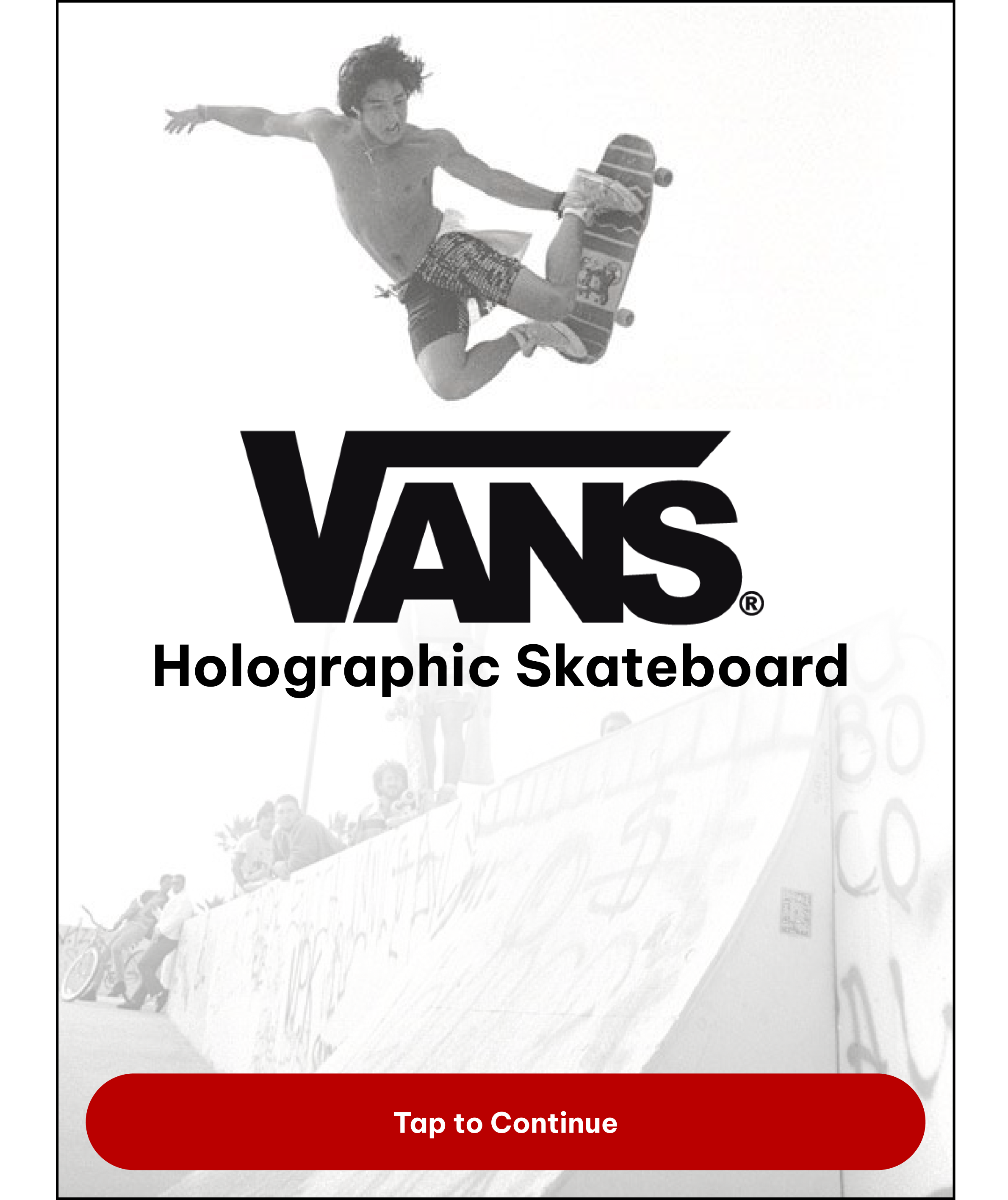
A young skateboarder is mid-air performing a trick at a skate park. The image is part of a Vans advertisement for a holographic skateboard, with a large Vans logo and the text 'Holographic Skateboard' on it. There is a red button at the bottom labeled 'Tap to Continue'.

Instructions for designing a deck on a mobile app, including steps for sizing, selecting the deck, designing the deck, and holo-display, with a red button labeled 'Tap to Continue' at the bottom.

Vans online sizing selection page showing user's height of 5'3", weight of 122 lbs, and shoe size of 6 in women's shoe size scale, with options to proceed to next step.

A user interface shows a deck selection screen for skateboards. The screen offers two options: a red button labeled 'Longboard' for tricks and portability, and a white outlined button labeled 'Skateboard' for cruising and transportation. A diagram of a longboard is displayed in the center, measuring 36 inches in length, with a 'Next Step' button below.

A skateboard deck selection screen showing a wooden skateboard deck, 28 inches long, with options for longboard or skateboard. The skateboard deck is in the center with a notation for 360-degree swipe below, and a red 'Next Step' button at the bottom.

A digital interface for selecting a skateboard deck style, showing options for Classic, Carver, and Old School, with a wooden skateboard deck displayed in the center.

A mobile app interface for selecting a skateboard deck type, showing options for Classic, Carver, and Old School with descriptions, and a large skateboard deck image in the center. The Carver option is highlighted. There is a red button labeled 'Next Step' at the bottom.

Vans skateboard deck selection screen showing three options: Classic, Carver, and Old School. Displayed is the Old School option, with a wooden skateboard deck in the center and a red Next Step button at the bottom.

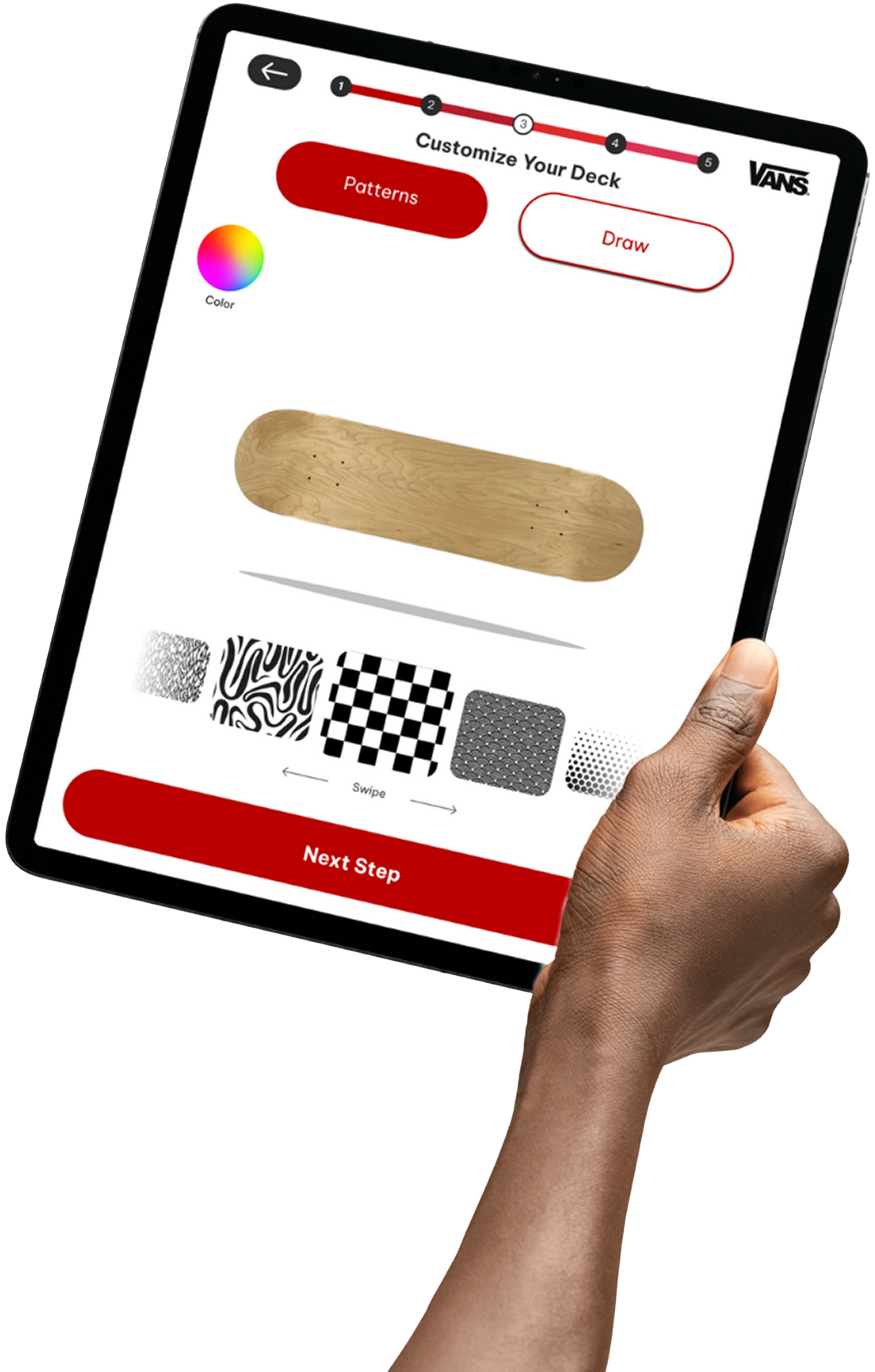
A skateboard deck customization screen with a natural wood finish, black and white pattern options for the grip tape, and red buttons for 'Patterns' and 'Draw' on a white background.

A skateboard customization app screen showing a wooden skateboard deck with a natural wood grain finish. The screen has options for color, draw, 360° swipe, camera, and eraser on the left side, and a large red button labeled "Next Step" at the bottom.

A digital interface for customizing a skateboard grip tape, with options to select patterns or draw, a color wheel, five pattern options, and a red button labeled 'Next Step'.

Mobile app interface for styling a skateboard grip tape, featuring options for patterns or drawing, color selection, and tools like draw, 360° view, camera, and eraser, with a "Next Step" button at the bottom.
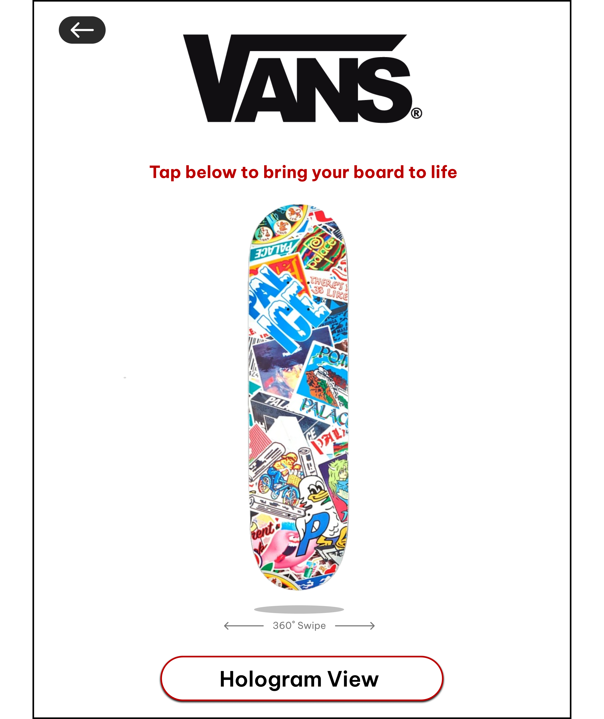
A mobile app screen showing a skateboard deck covered with colorful stickers and graffiti. The screen includes the Vans logo at the top, a prompt to tap to bring the board to life, a swipe indicator, and a button labeled "Hologram View".
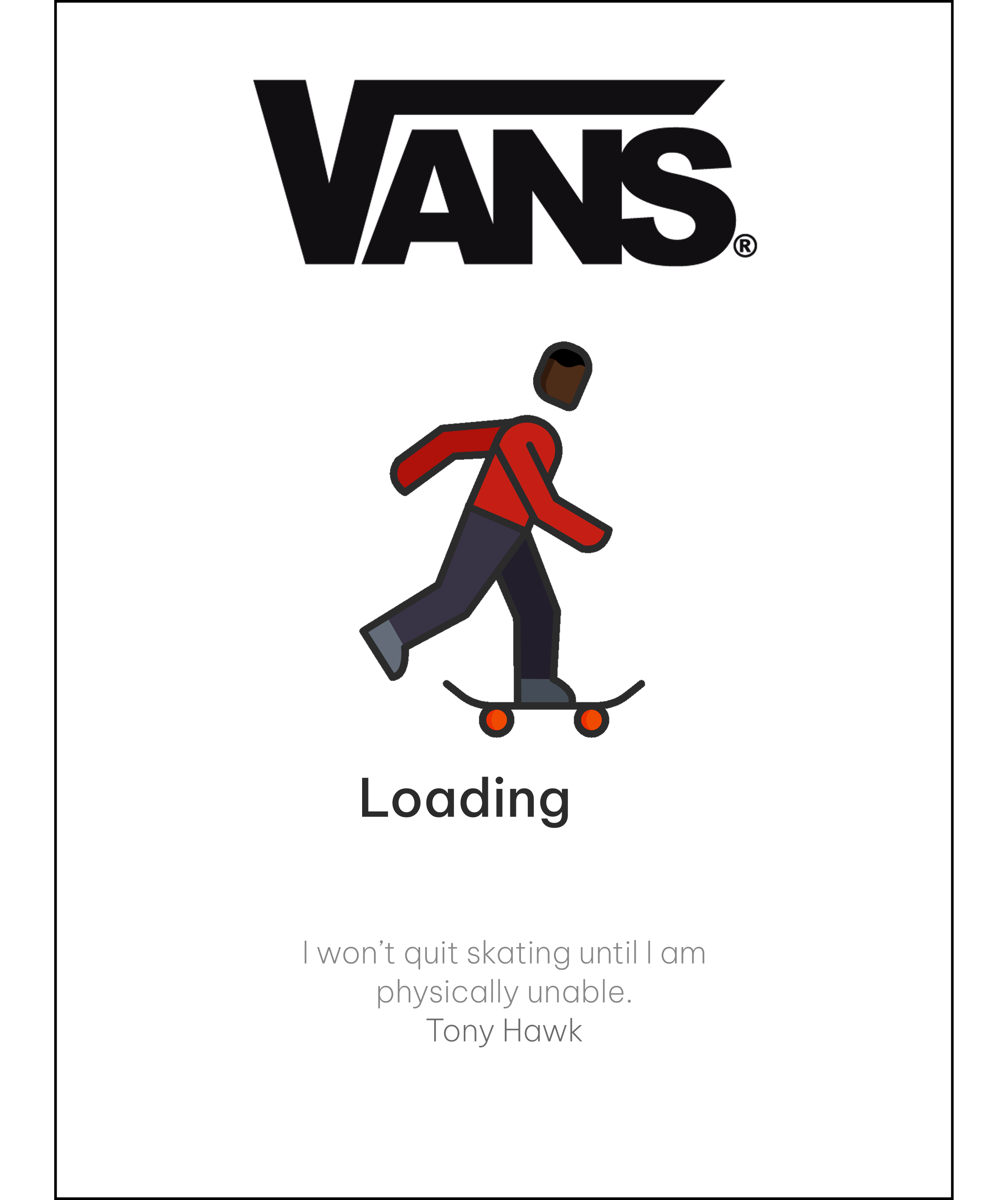
Vans logo with a cartoon person skating and the word "Loading" below, and a quote by Tony Hawk that reads "I won't quit skating until I am physically unable."
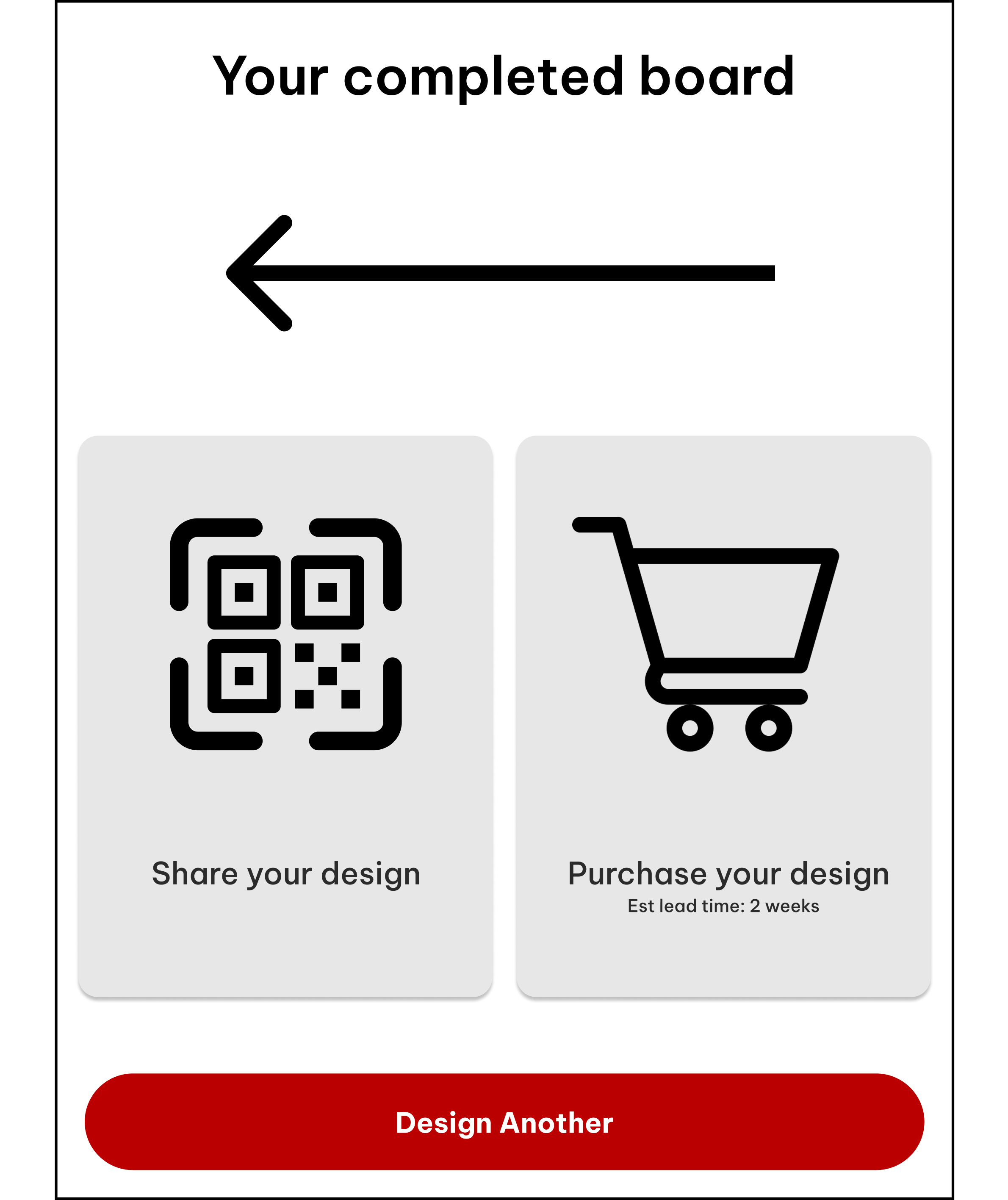
A digital interface screen showing options to share or purchase a design, with a red button labeled 'Design Another' at the bottom.
UI Design and Branding
The Vans Holodeck UI takes inspiration from skate culture while keeping the experience simple and approachable. The bold red highlights, clean type, and rounded elements nod to Vans’ identity without overpowering the deck itself. Each screen is touch-friendly and guided by clear steps, allowing users to explore, customize, and visualize their board in 360° without feeling overwhelmed. Overall, the interface focuses on creativity, expression, and letting users feel ownership over what they build.
Red is a part of VANS’ identity and is used for emphasis and call-to-action buttons. It creates a strong visual hierarchy and draws users to interactive elements.
Typography supports VANS’ brand tone by being approachable, modern, and functional. Creating an easy-to-understand navigation experience.


BUTTONS

Prototyping and Testing
To ensure users had the best experience with the app, we conducted usability testing with ten participants. We asked them to complete tasks and share feedback on their overall experience, pain points, and any areas of confusion. This process helped us identify what worked well and where improvements were needed, guiding refinements to navigation and clarity.
360° SWIPE
Check out my Prototype!
Click Expand to Start!!
100% of users found the large red buttons to be the most functional, and they all suggested condensing buttons and slides.

30% of users did not understand or believe the interface was necessary.
RESULTS
Reduced the amount of pages
Reduced the amount of clickable elements
Emphasized importance for having the interface
Conclusion and Key Takeaways
The Vans Holodeck reimagines product customization by turning skate culture and technology into a hands-on experience. This project taught me how to balance simplicity, brand expression, and playful interaction to create something personal and memorable. Holodeck shows how thoughtful UI can transform a product into an experience users feel connected to.
Offsets Vans skate brand from other skate companies
Appeals to all people due to easy usability
Targets users extrinsic and intrinsic reward systems